The original thumbnail for Jason Allan Scott had genuine energy. His expression was animated, his setup was professional, and the shot was well-composed. On any other platform, it would have been a strong image. On YouTube, it had one critical problem: it didn't tell you what the video was about.
Podcast and educational creators often fall into this trap. The face-forward shot feels authentic and compelling in isolation — but in a feed surrounded by thumbnails from every niche imaginable, it doesn't answer the only question that matters: why should I click this video?
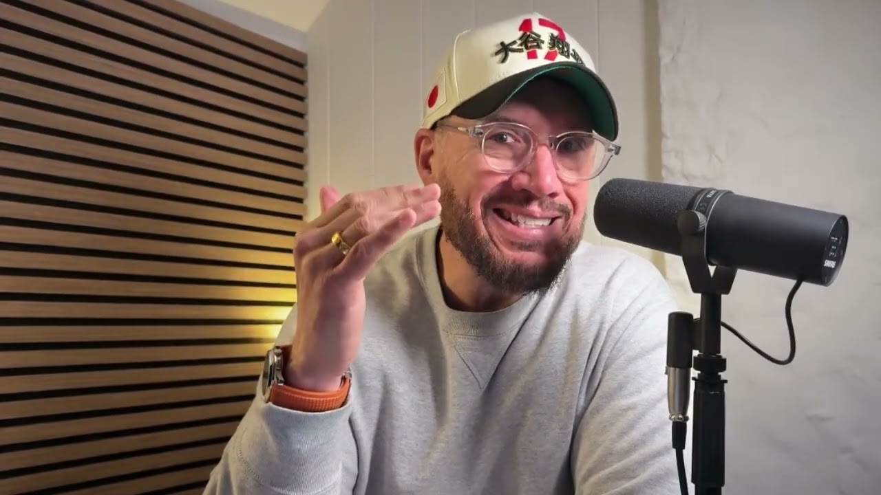 Before
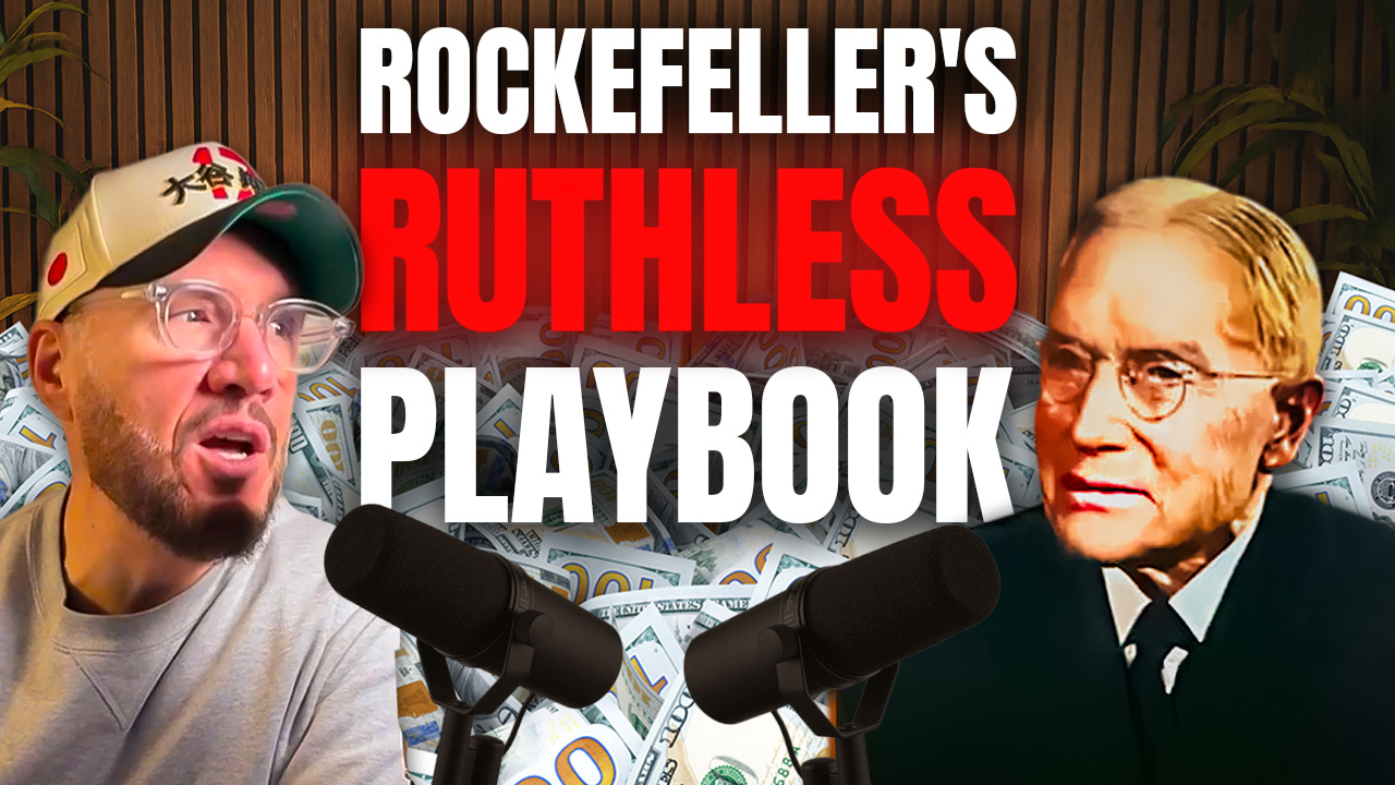 After
After
A compelling face is a starting point, not a complete thumbnail. The redesign added "Rockefeller's Ruthless Playbook" as the text hook, introduced a split composition with Rockefeller's image for depth and intrigue, and used high-contrast red text that stands out in any feed. The result: the viewer now knows exactly what they're clicking into — and why it's worth their time.
The before: great energy, missing the story
Jason's original thumbnail communicated one thing clearly: the host is engaged and expressive. That's valuable, but it's incomplete. A viewer scrolling past had no way to know if this was a business episode, a personal development talk, a finance breakdown, or something else entirely.
Without a topic hook, the thumbnail relied entirely on the creator's existing audience to do the work — people who already know Jason and trust him enough to click anything he posts. For growing a channel, that's not enough. New viewers need a reason to click that doesn't depend on prior familiarity.
Where do your thumbnails actually stand?
Get a personalised CTR score and 3 specific fixes for your niche — free.
The after: context that earns the click
The redesign answered the missing question immediately. "Rockefeller's Ruthless Playbook" tells the viewer exactly what the video covers — a specific, intriguing topic that creates instant curiosity. It's a topic with weight: Rockefeller is a recognisable name associated with wealth, strategy, and ruthless business thinking. The word "Ruthless" adds an edge that makes it impossible to ignore.
The split composition adds visual depth — Jason on one side, Rockefeller on the other — which implies a comparison or deep-dive rather than a surface-level overview. High-contrast red text makes the title impossible to miss, even at thumbnail size on a mobile screen.
"Educational content needs thumbnails that sell the story before the click. Energy alone doesn't give new viewers a reason to stop scrolling."
This case study reflects a pattern common across channels building topical authority: the content is often strong, but the thumbnail isn't communicating the depth of what's inside. A specific, well-framed topic hook is the fastest way to close that gap.
A good photo isn't always a good thumbnail. Thumbnails need context — viewers must immediately understand what the video is about and why it's worth clicking. Without a text hook or supporting visual that tells the story, even an energetic, well-composed shot can fail to communicate enough to earn the click.
A split composition places two subjects side by side — typically the creator and another person, character, or object. It adds depth, creates contrast, and implies a relationship or comparison. For educational content, it visually signals that the video involves two perspectives or a specific topic beyond just the host talking.
Yes, almost always. Educational content covers a huge range of topics — without text, a viewer has no way to know if this video is relevant to them. Bold, specific text that names the topic or angle tells the viewer exactly what they're getting, which dramatically increases the likelihood of a click from the right audience.
Critical. Thumbnails are displayed at small sizes on most devices. Low-contrast text disappears. High-contrast text — white or bold red on a dark background — is readable at a glance even on a phone screen. If you can't read it clearly on a phone from arm's length, it's not working.
The most effective podcast thumbnails name the topic or guest clearly, use a split composition if the content involves a key reference or interviewee, and include a bold text hook that creates curiosity. Energy in the host's expression helps, but without context, even great energy doesn't tell the viewer why to click this episode over any other.
Start with a free CTR audit — 6 questions, personalised score, sent to your inbox.
Take the free audit