A street art backdrop should make a thumbnail stand out. Bold colours, visual texture, a setting that signals creativity. And yet the original thumbnail for this finance and crypto channel was underperforming — not because the backdrop was bad, but because everything around it was too passive.
The creator stood centred, facing front, with a neutral expression. The composition gave no sense of movement or stakes. In a feed full of thumbnails competing for attention in under a second, "interesting background" isn't enough. The person has to carry the energy.
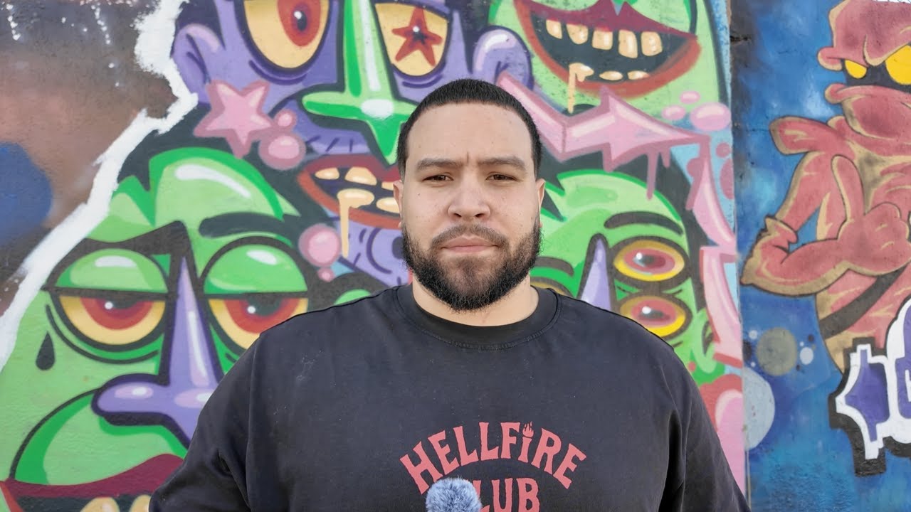 Before
 After
After
A busy background draws the eye away from the subject. A static pose signals nothing urgent. For finance and crypto content — where urgency is the whole point — the redesign replaced the backdrop with a high-energy gradient, introduced an upward camera angle for authority, and led with a direct question hook. The result is a thumbnail that feels as fast as the content it represents.
The before: visually interesting, strategically flat
The original thumbnail had things going for it. The street art background was distinctive and colourful. The creator's face was clearly visible. But three things were working against it.
First, the centred, symmetrical composition read as static — there's no implied movement or tension. Second, the neutral forward-facing pose gave no emotional signal. Third, there was no text hook — nothing that told the viewer why this specific video was worth clicking right now.
Where do your thumbnails actually stand?
Get a personalised CTR score and 3 specific fixes for your niche — free.
The after: urgency built into every element
The redesign started from a different question: what does this video feel like? A "when to buy" crypto video is about speed, decision-making, and stakes. Every visual element should reinforce that.
The street art backdrop was replaced with a vibrant gradient — not because gradients are inherently better, but because this gradient communicates movement and momentum. The camera angle shifted upward, which reads as confidence and authority. A bold text hook, "WHEN TO BUY?", gives the viewer an immediate reason to click. And neon lighting effects match the fast-paced energy of the topic.
"Financial decision content performs when it feels urgent, not passive. The backdrop is never the problem — the energy is."
This redesign is a good example of a broader principle: finance and crypto thumbnails that convert don't rely on visual interest alone. They communicate stakes. The viewer should feel something — curiosity, urgency, anticipation — before they've read a single word.
Crypto and finance content performs when it feels urgent. The most effective thumbnails use dynamic poses, a direct question or bold claim as the text hook, high-contrast backgrounds, and lighting that conveys energy. Static, neutral shots — however well-composed — don't communicate the speed and stakes of financial decision content.
Yes, significantly. Pose communicates emotion at a glance. An upward-angled shot suggests confidence and authority. A centred, static pose reads as passive. On a crowded YouTube feed, the pose is often the first thing a viewer registers — before they read any text.
Usually. A visually interesting background competes with the face and text for attention. Viewers process thumbnails in under a second — anything that splits focus away from the subject or hook works against CTR. Clean, high-contrast backgrounds direct the eye to what matters.
A direct question or bold claim works best. Something like "WHEN TO BUY?" or "$47K SAVED" gives the viewer a specific reason to click. Avoid descriptive titles that explain the content — that's what the video title is for. The thumbnail text should create curiosity or urgency, not summarise.
Start by identifying what the thumbnail is competing against in its niche. Then isolate the one emotion or question the video should trigger. Replace anything that creates visual clutter or passivity — flat backgrounds, centred static poses, explanatory text. Replace it with energy, contrast, and a hook.
Start with a free CTR audit — 6 questions, personalised score, sent to your inbox.
Take the free audit